2019 ・ Monese
Digestible Pricing
Working as the sole designer of Monese's Personal Banking squad, I designed, tested, and supported delivery on a new pricing plan selection flow that reduced cognitive load and increased conversion and revenue.
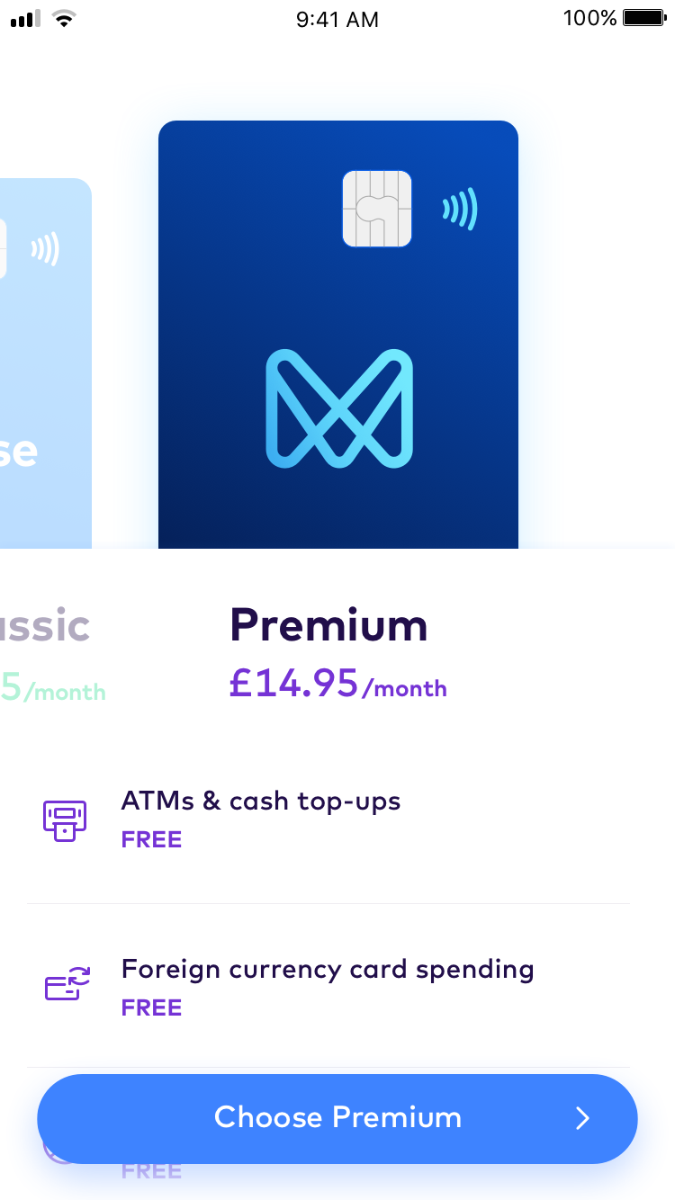
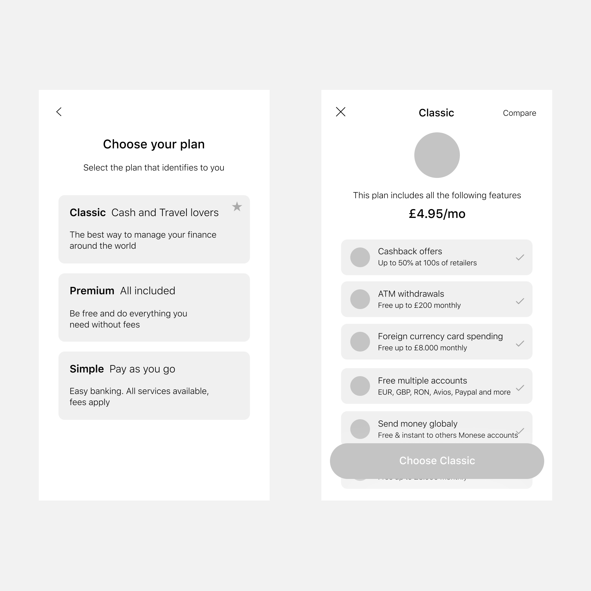
A key moment in Monese's onboarding journey, a customer's choice of one of three pricing plans has a large impact on their lifetime value to the business.
As such, it was one of the Personal Banking team's priorities to optimise and refine this process.

Background
01
After months of A/B testing and a gradual creep in complexity, we observed that participants in our testing sessions found the plan selection screens overwhelming.
02
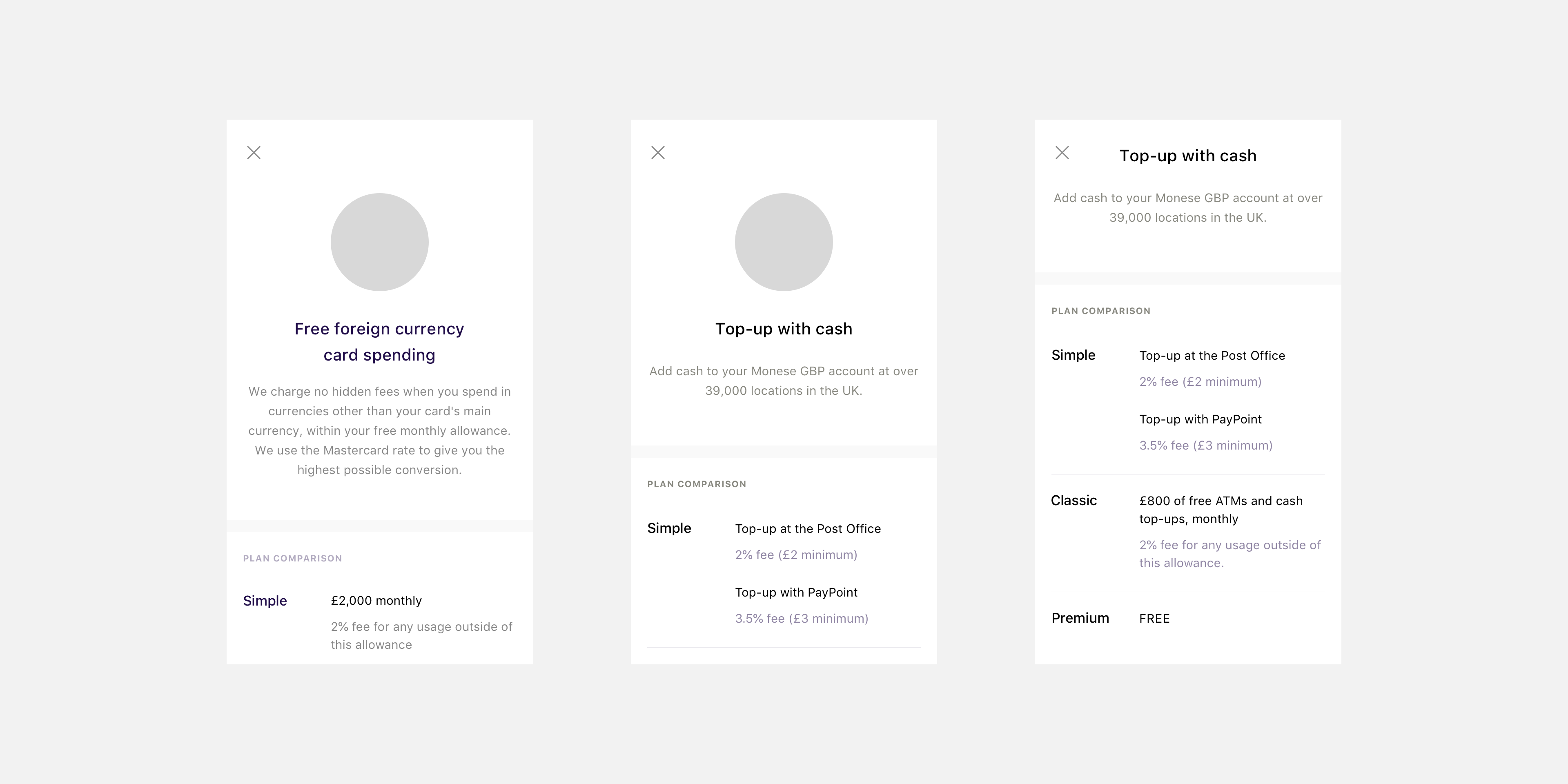
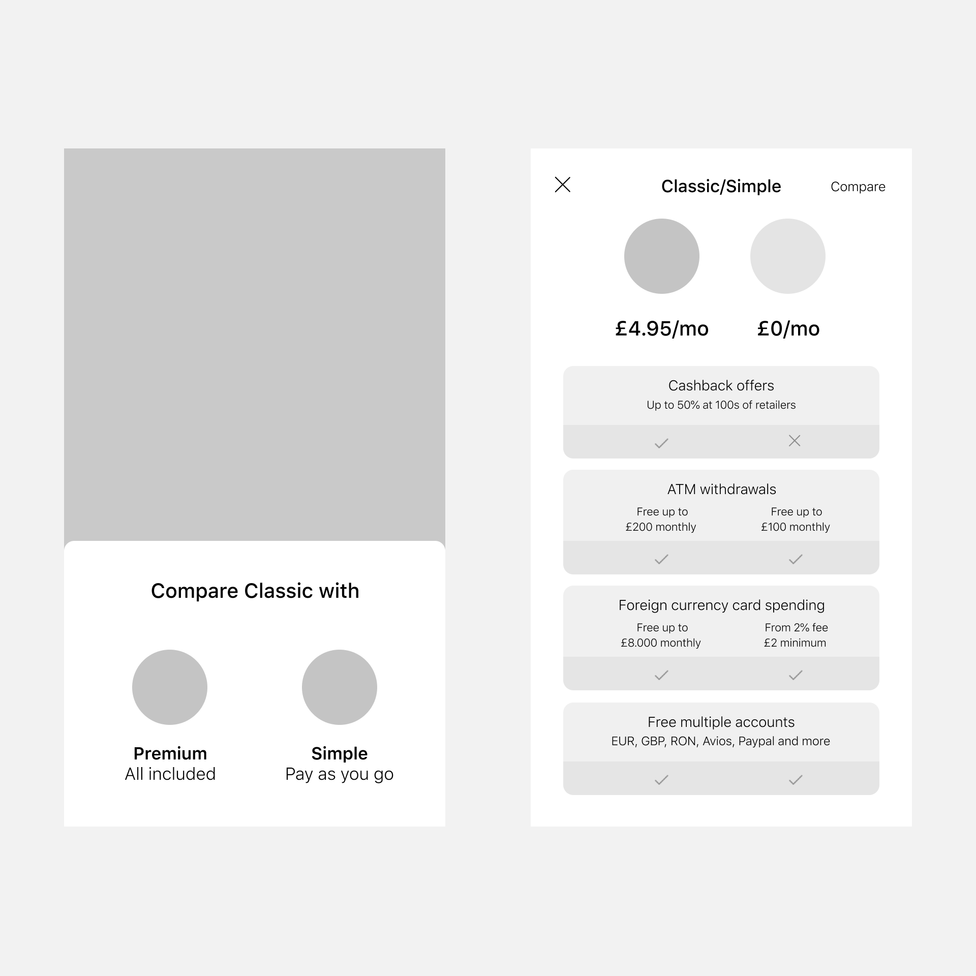
As the pricing plans themselves became more complex, we began to get feedback telling us it was hard to compare each plan during the selection process.
03
We'd previously seen how people feeling overly funneled into a paid plan could hurt conversion. It was essential that they felt they could make an informed choice.
My hypothesis — we had too much information to convey within a single step flow.
If we stretched the process out over multiple steps we could progressively disclose details, making the process less overwhelming and more digestible.
We could validate this through testing sessions, but we'd expect to see an increase in conversion, activation and retention as a result.
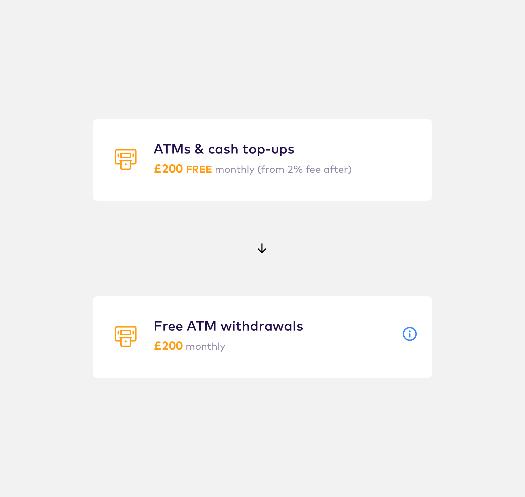
Starting with a quick win
From what we knew already, it seemed clear that we would need a more dramatic change, but I started with a quick win to keep the team going whilst I designed out a bigger overhaul.
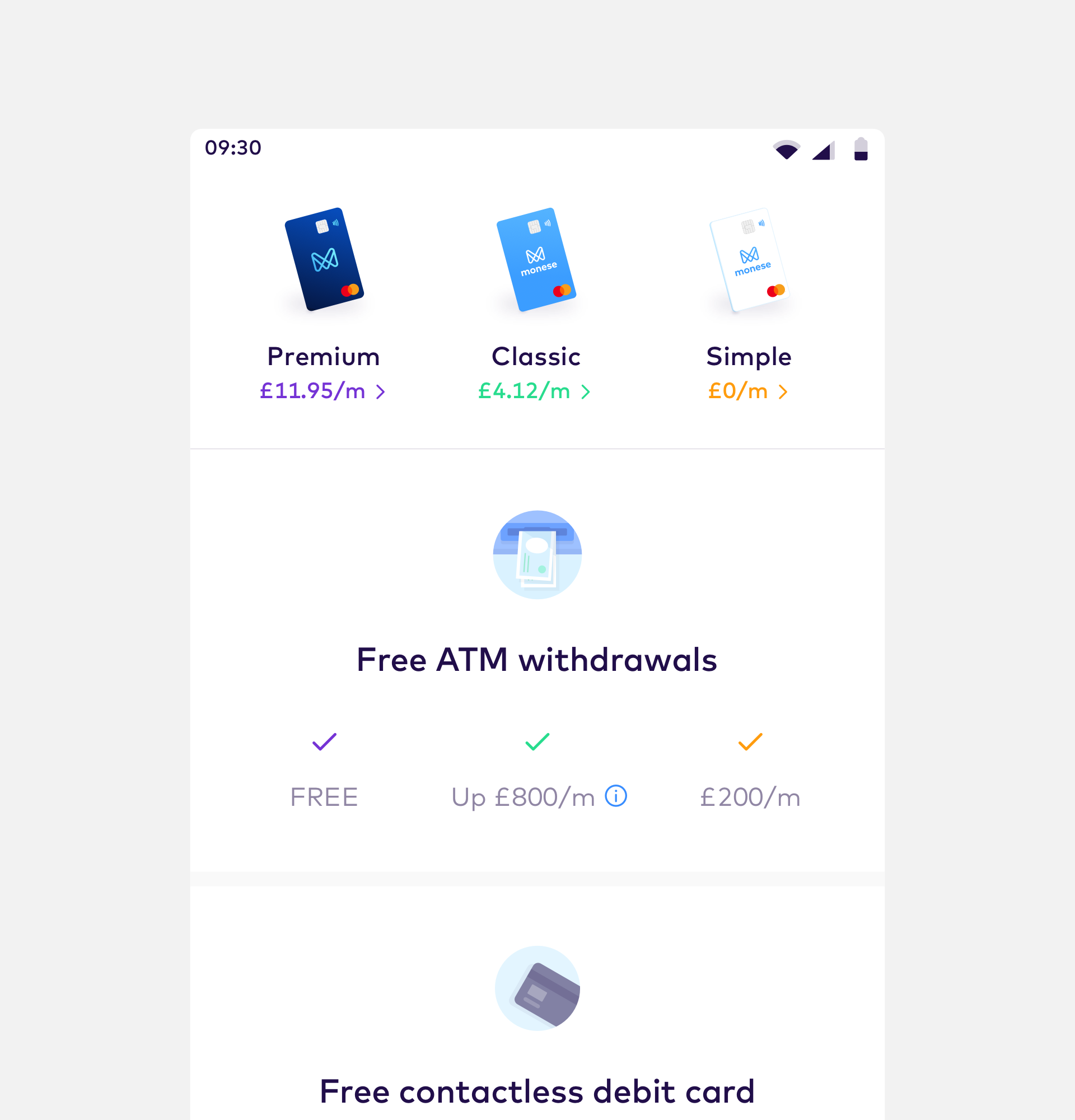
With multiple fee-free monthly allowances that each covered use of different features, with differing fees if those allowances were exceeded (which also changed between each plan), the nuances weren't easy to convey at a glance.
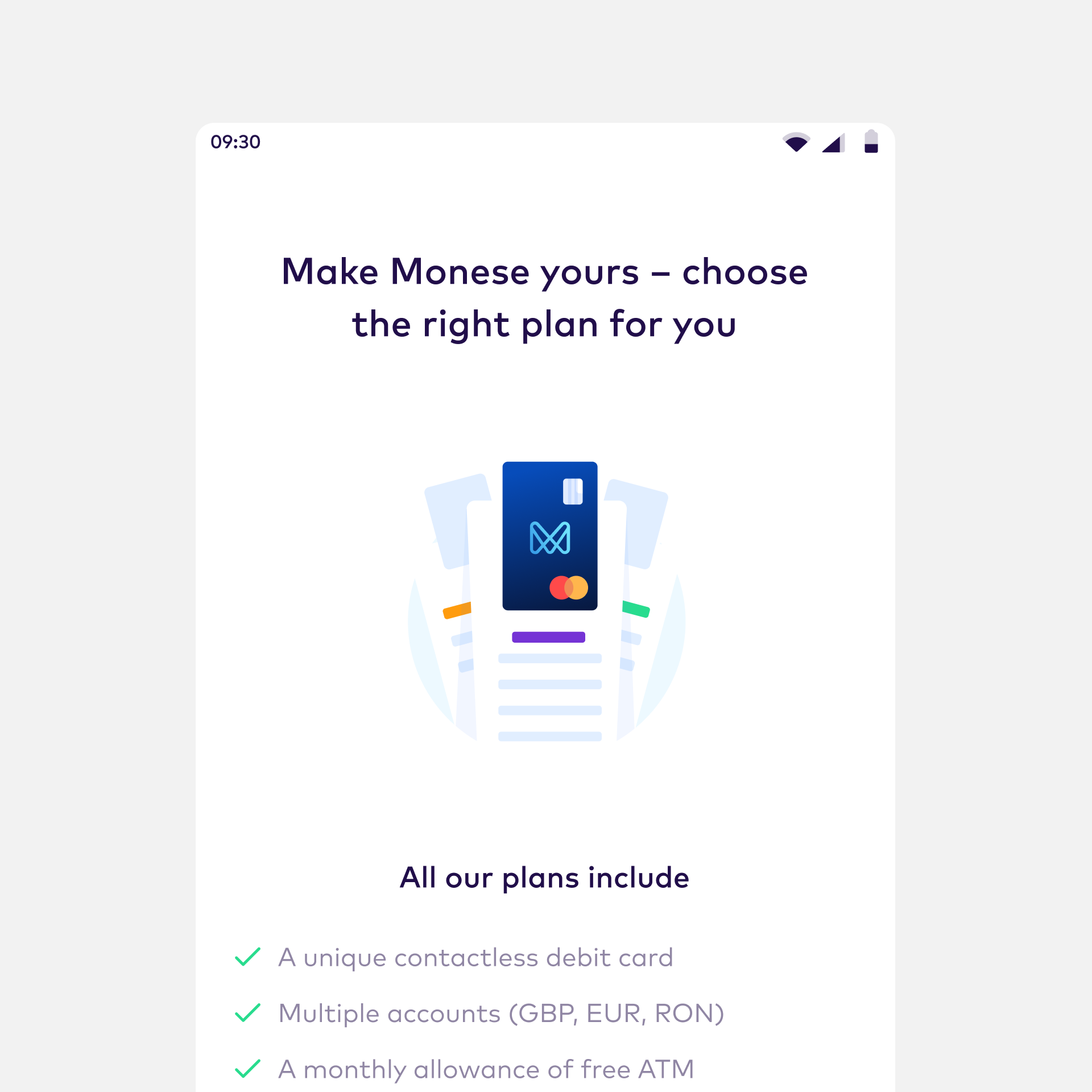
I utilised the same principles of progressive disclosure that formed the original hypothesis to reduce the amount of upfront details as a quick way to reduce cognitive load.
Exploring for bigger impact
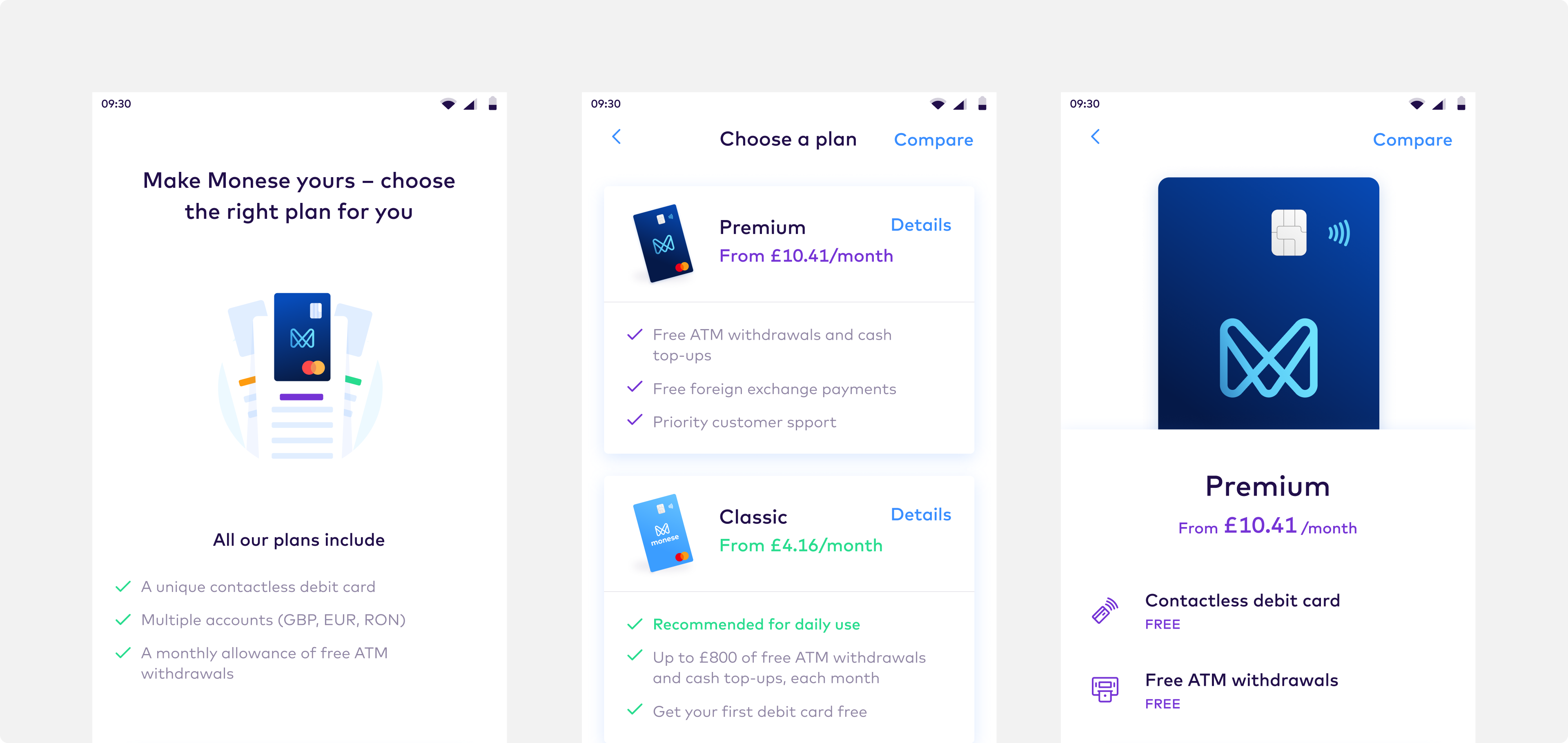
Working with another designer, we explored ideas around the theme of how we could summarise, differentiate, and facilitate comparison of plans.
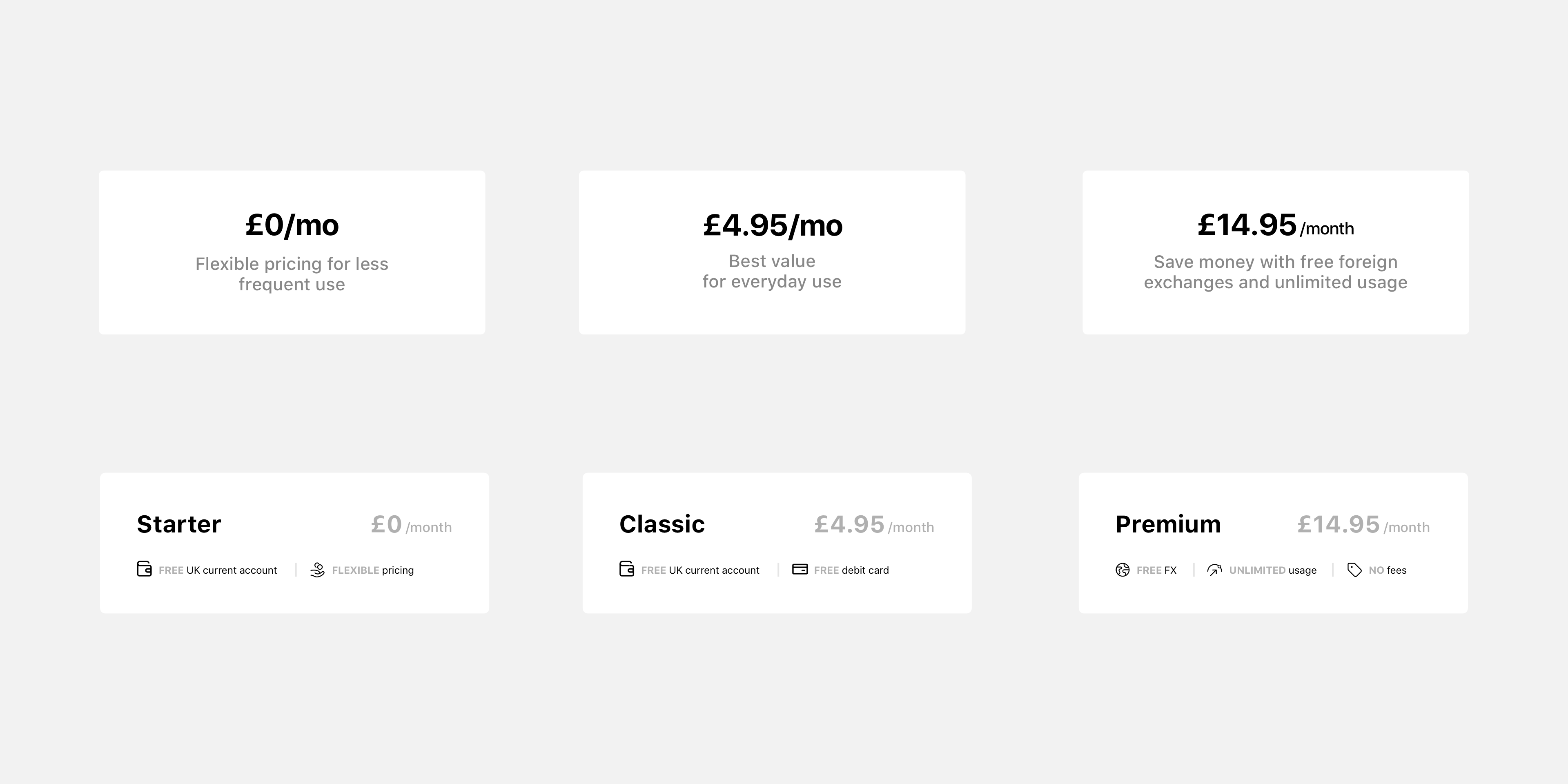
Refinement
With a clear direction, I refined these designs into something we could test.